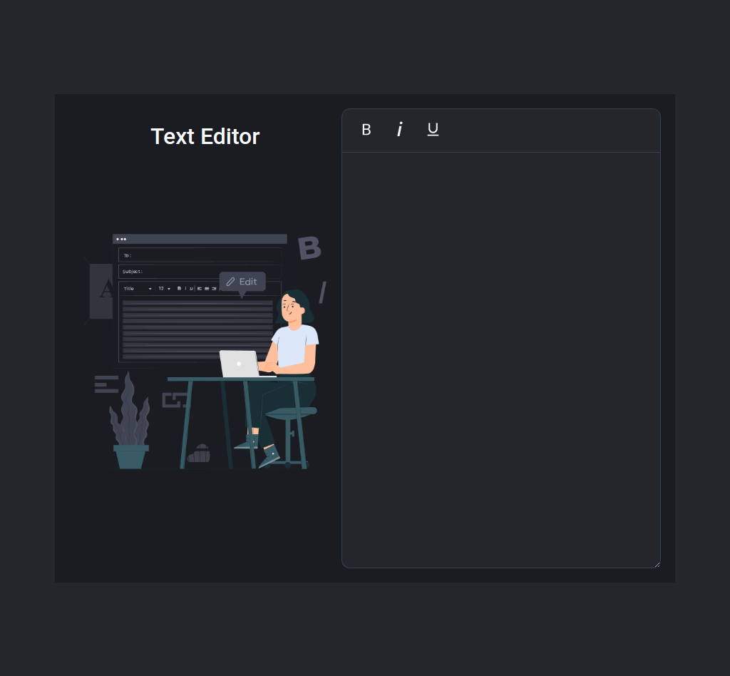
The goal of this coding exam is to quickly get you off the ground with Dynamic Styling Using Styled Components.
Click to view
Click to view
- Download dependencies by running
npm install - Start up the app using
npm start
Functionality to be added
The app must have the following functionalities
-
Initially, #f1f5f9 color is applied to all the three bold icon, italic icon, underline icon buttons
-
When the bold icon button is clicked,
- It will change to an active state by applying the #faff00 color
- The bold font-weight is applied to the text in the HTML textarea element
- If the bold icon button is already in the active state,
- The respective button should be inactive by applying #f1f5f9 color
- The normal font-weight is applied to the text in the HTML textarea element
-
When the italic icon button is clicked,
- It will change to an active state by applying the #faff00 color
- The italic font-style is applied to the text in the HTML textarea element
- If the italic icon button is already in the active state,
- The respective button should be inactive by applying #f1f5f9 color
- The normal font-style is applied to the text in the HTML textarea element
-
When the underline icon button is clicked,
- It will change to an active state by applying the #faff00 color
- The underline text-decoration is applied to the text in the HTML textarea element
- If the underline icon button is already in the active state,
- The respective button should be inactive by applying #f1f5f9 color
- The normal text-decoration is applied to the text in the HTML textarea element
-
More than one button can be active at a time and more than one style can be applied to the text in the HTML textarea element
Click to view
The following instructions are required for the tests to pass
VscBold,GoItalicandAiOutlineUnderlineicons from react-icons should be used forbold,italicandunderlinebuttons respectively- Wrap the
VscBoldcomponent with an HTML button element and add thedata-testidattribute value asbold - Wrap the
GoItaliccomponent with an HTML button element and add thedata-testidattribute value asitalic - Wrap the
AiOutlineUnderlinecomponent with an HTML button element and add thedata-testidattribute value asunderline
Example:
<Button data-testid="bold">
  <VscBold size={25} />
</Button>- Use
styled-componentsfor styling elements
Colors
Hex: #25262c
Hex: #1b1c22
Hex: #f8fafc
Hex: #334155
Hex: #f1f5f9
Hex: #faff00
Hex: #cbd5e1
Font-families
- Roboto
- All components you implement should go in the
src/componentsdirectory.
