-
Notifications
You must be signed in to change notification settings - Fork 85
New issue
Have a question about this project? Sign up for a free GitHub account to open an issue and contact its maintainers and the community.
By clicking “Sign up for GitHub”, you agree to our terms of service and privacy statement. We’ll occasionally send you account related emails.
Already on GitHub? Sign in to your account
Project - Maria Carda #92
base: main
Are you sure you want to change the base?
Conversation
✅ Deploy Preview for mucss-dataviz ready!
To edit notification comments on pull requests, go to your Netlify site configuration. |
There was a problem hiding this comment.
Choose a reason for hiding this comment
The reason will be displayed to describe this comment to others. Learn more.
Great work! Some minor comments below.
| title: "How housing is no longer a right" | ||
| description: Visualization of the housing crisis in Spain according to official data from the Ministry of Transportation. | ||
| categories: "2024" | ||
| author: Maria Carda Gargallo |
There was a problem hiding this comment.
Choose a reason for hiding this comment
The reason will be displayed to describe this comment to others. Learn more.
Carda-Gargallo. Otherwise, the template would think that only Gargallo is your surname.
|
|
||
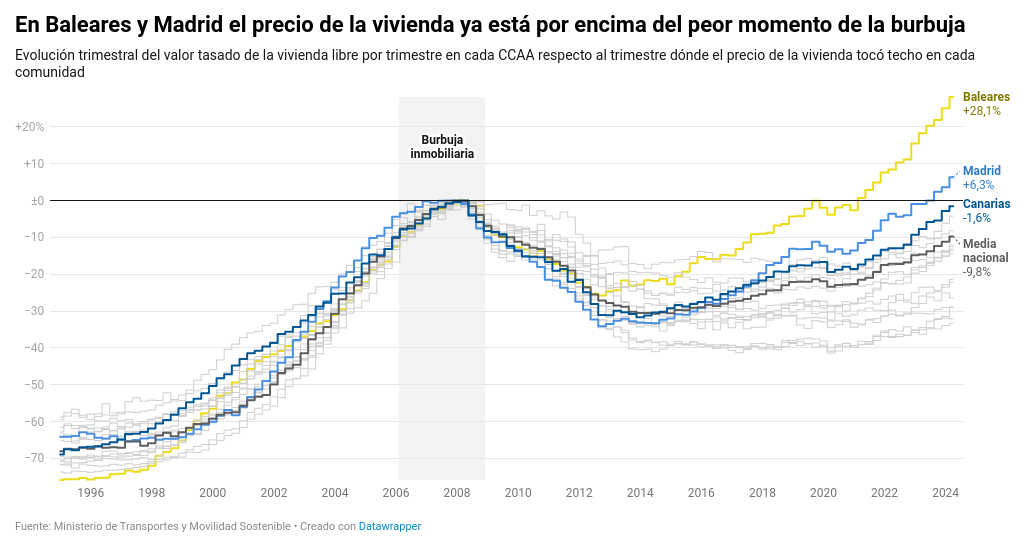
| The graph shows the *Quarterly evolution of the appraised value of free housing per quarter in each Autonomous Community with respect to the quarter where the price of housing peaked in each community*, i.e. the variation in the appraised price of housing with respect to the 2008 crisis. It highlights the values of three communities (Madrid, Baleares and Canarias), which are those with the fastest growth trends in recent months. | ||
|
|
||
|  |
There was a problem hiding this comment.
Choose a reason for hiding this comment
The reason will be displayed to describe this comment to others. Learn more.
Please set it as external as e.g. David does here.
| The second part is to represent the highlighted regions, which are those contained in the vector of the previous steps and they are colored by region. | ||
|
|
||
| ```{r} | ||
| mi_grafico_mal <- mi_grafico_mal + geom_step(data = subset(data_filtered, CCAA %in% comunidades_destacadas), aes(color = CCAA), |
There was a problem hiding this comment.
Choose a reason for hiding this comment
The reason will be displayed to describe this comment to others. Learn more.
Note that this line is too wide, and goes off the page in the resulting HTML depending on the screen size. It's a good practice to wrap your code so that every line has a maximum length of 80 characters approx. Review the rest of the post to solve these kind of problems, please.
|
|
||
| However, this final graph has an issue since Ceuta and Melilla are not represented in the original graph. Therefore, the data is filtered to eliminate this two regions and then the code is executed altogether to represent the graph correctly. | ||
|
|
||
| ```{r, fig.height=8, fig.width=17} |
There was a problem hiding this comment.
Choose a reason for hiding this comment
The reason will be displayed to describe this comment to others. Learn more.
Please add the option preview = TRUE so that this image is highlighted in the gallery.
Visualization of the housing crisis in Spain according to official data from the Ministry of Transportation