new-ap-vid.mp4
- Learn about the App Platform and its features.
-
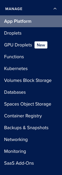
Select App Platform from the DigitalOcean cloud console in the left sidebar.
-
Click the "Create App" button.
-
Connect your GitHub account to the App Platform.
-
Once you connect your GitHub account, select the repository you want to deploy. This should be the project you've been working on.
-
The branch that is selected should be main and the source directory should be "/start". Leave Autodeploy checked. This will redeploy your site every time you push main to GitHub.
-
Click "Next".
-
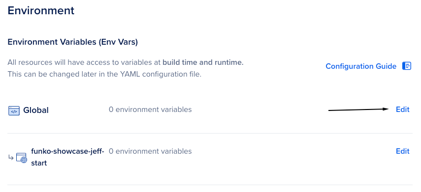
Click the "Edit" button next to Global.
-
Click the "Bulk Editor" button.
-
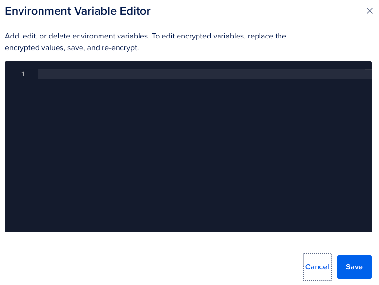
Copy the contents of your ".env" file you created earlier into the box.
-
Click "Save".
NOTE: It is a best practice to encrypt your environment variables. If your application is logging them, it will write their plain text to the logs if they are not encrypted.
-
Click "Next".
-
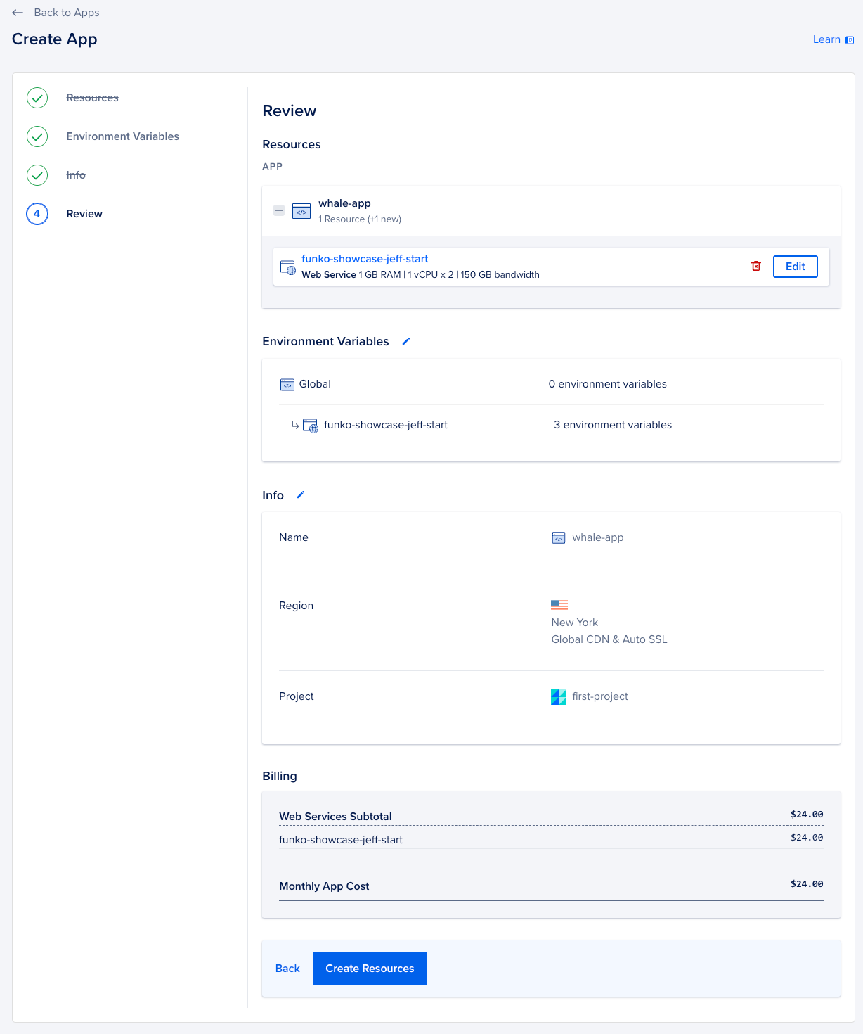
The
Infoscreen shows your your app and region information. No changes needed here. Click "Next". -
Review your choices before deploying your new app. No changes should be necessary.
-
Click "Create Resources". This will definitely take a few more minutes. Time to hydrate?
- Click the `Go To Build Logs" button. You can watch live as the server is configured and your app is deployed.
- Once the Build is completed, you can also watch the Deploy Logs to watch the app spin up.
- Once deployment has completed, visit the app's public URL to verify it's running correctly.
- It's time to go back to our local codebase and make some more meaningful changes to our UI.
- In your
/startdirectory, open the file/components/FunkoCard/FunkoCard.tsx. - You will see a code block that defines each of the "cards" for our collection items. Currently, it only contains a
<CardMedia/>tag, but we want to include the rest of the data from our database in this interface.<Card sx={{ maxWidth: 345 }}> <CardMedia component="img" sx={{ height: 140 }} image={funko.imageUrl} alt={funko.character} /> </Card>
- After the
<CardMedia/>tag, add a new, empty<CardContent></CardContent>node. - Inside the
<CardContent>, we can add our first text element:<Typography>. This a specific element from MaterialUI for rendering text. If you haven't used MaterialUI before, that's OK. Here's some light reading about Material UI. - Add the following line into your
<CardContent>element. The{funko.source}is a reference to the data our app is pulling from the database earlier in the page.<Typography gutterBottom variant="h2" component="div" sx={{ fontSize: '2em', fontWeight: 'bold' }}>{funko.source}</Typography>
- Below that line, we can add another one for the character's name.
<Typography gutterBottom variant="h3" component="div" sx={{ fontSize: '1em' }}>{funko.character}</Typography>
- There are two data properties left:
yearReleasedandnumberInLine. These are less important, so we can use a smaller font for these.<Typography variant="body2" color="text.secondary">Released: {funko.yearReleased}</Typography> <Typography variant="body2" color="text.secondary">Number in Line: {funko.numberInLine}</Typography>
- We're going to give users the ability to edit items in their collection. (We all make mistakes, right?) We can add an Edit button at the bottom of each card. Since this is not technically
CardContentbut still part of theCard, we are going to put this element right after the closing</CardContent>tag.<EditFunkoButton funko={funko} setFunkos={setFunkos} />
NOTE: If you ever get stuck, and can't fix your code, there's a copy of the entire app in the
/finalfolder that is complete. You can use those files if you need to fix something. - Navigate to the
EditFunkoButton.tsxfile in the/components/EditFunkoButtondirectory. - In the code block below, you are going to modify it to have the
<Button>element as well as<Dialog>and<DialogContent>elements. Within the<DigalogContent>you are going to had 5<TextField>'s for each of the data properties in the databse. You can choose the order of those but a good practice is to match the order that the data is displayed.
<TextField
    autoFocus
    margin="dense"
    name="imageUrl"
    label="Image URL"
    type="url"
    fullWidth
    value={}
    onChange={handleInputChange}
/>- At the end of the
<DialogContent>component you will add a<DialogActions>component and within that will be two<Button>elements. One will be for the user to cancel the edit and the other will be for the user to submit the edit. Change the color of the buttons to match any color provided by MaterialUI.
<DialogActions>
    <Button onClick={handleClose} color="">
        Cancel
    </Button>
    <Button onClick={handleSubmit} color="">
        Submit
    </Button>
</DialogActions>-
Now let's say we want to add an "Add Button" to our app so users can add new items to their collection. We can add a button to the top of the page that will open a dialog box with a form for the user to fill out. This form will be similar to the one we used to edit items in the collection.
-
Navigate to the
AddFunkoButton.tsxfile in the/components/AddFunkoButtondirectory. -
In the code block below, you are going to modify it to have the
<Button>element as well as<Dialog>,<DialogTitle>and<DialogContent>elements. Within the<DigalogContent>you are going to add 5<TextField>'s for each of the data properties in the databse. You can choose the order of those but a good practice is to match the order that the data is displayed. -
The
marginproperty is a part of the MaterialUI component. You can change this based on how you want the vertical spacing to look. For more info on that, check out this link TextField API.
<div style={{ display: 'flex', justifyContent: 'center', alignItems: 'center', marginBottom: '10px' }}>
</div><Button variant="contained" color="secondary" onClick={handleClickOpen}>
Add Funko!
</Button><TextField
margin=""
name=""
label=""
type=""
fullWidth
value={}
onChange={handleInputChange}
/>- Within the
<Dialog>component, you will add a<DialogActions>component and within that will be two<Button>elements. One will be for the user to cancel the addition and the other will be for the user to submit the addition. Change the color of the buttons to match any color provided by MaterialUI.
<DialogActions>
    <Button onClick={handleClose} color="">
        Cancel
    </Button>
    <Button onClick={handleSubmit} color="">
        Submit
    </Button>
</DialogActions>- Navigate to the
index.tsxfile in the/pagesdirectory. - Add the following line of code below the
<SearchBar>component. This will autoimport the component at the top of the file and will add the "Add Funko!" button to the top of the page.
<AddFunkoButton setFunkos={setFunkos} />- When you're happy with how your new cards appear, it's time for the AppPlat deployment magic. To best experience this, I recommend having a browser tab open to your AppPlat app. (It's the page where you watched the Build and Deploy logs earlier.) When you're ready, commit your changes and push them to GitHub.
git add .
git commit -m "ADD NEW COMMIT MESSAGE HERE OF YOUR CHOICE"
git push origin main
- Now go watch that App Platform page! It will automatically recognize that you made changes to your code, and auto-builds and auto-deploys them for you! When it's done, you should see your new
Cardchanges at your production URL!