Replies: 25 comments 33 replies
-
|
I don't know if I’ve missed it, but there is a document or a text explaining why you chose the name Biome? Maybe it can help in designing the logo and the icon.. |
Beta Was this translation helpful? Give feedback.
-
|
I have no art skills but I wonder if there's something we could do around pruning shears etc, seeing as we're linting and formatting code like someone would prune and tidy a garden to help it thrive |
Beta Was this translation helpful? Give feedback.
-
|
Some basic guidelines I am thinking about:
|
Beta Was this translation helpful? Give feedback.
-
Beta Was this translation helpful? Give feedback.
-
|
My two cents.. I'm not convinced with the result, but maybe this experiment can help to define the field.. |
Beta Was this translation helpful? Give feedback.
-
|
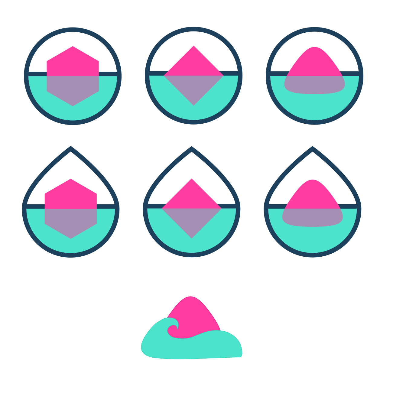
First, get rid of the yellow. Yellow sucks to work into your brand because its hard to create enough contrast and it tends to fall into the background. Yellow is also too much of the same as Rome. And you should definitely try to be something new instead of forever holding onto Rome as a history. The only other reason for yellow is the JS logo and Biome is not just a JS tool so why would you link it that strongly. Second, Biome is a rich word, and its link to what the tool is is obvious, I would embrace its more natural meaning to give the 'brand' some life (pun intended). I would look for inspiration in like space domes for sort of self-contained biomes. Imagine a little bubble dome with water and a tropical island, or a lush rainforest, or a tiny icy wonderland. What could that look like as a logo? Maybe could even have different variations on it based on the sub-tool. |
Beta Was this translation helpful? Give feedback.
-
|
I tried to create a custom logo inspired by the lighting thunder emoji. This could be improved (in particular the interior shape). |
Beta Was this translation helpful? Give feedback.
-
Beta Was this translation helpful? Give feedback.
-
|
Quick exploration branch, I'm gonna try to make vector logos based on this vibe later. pretend it isnt a heavily used chopping board in my backyard |
Beta Was this translation helpful? Give feedback.
-
|
Hopefully not too late for this! I incorporated the suggested colors but used them more sparingly only within the icon itself. You can see how this works both on dark and light backgrounds. The type is strong enough to use isolated as well but I would suggest keeping them together for most applications. |
Beta Was this translation helpful? Give feedback.
-
|
Going off of HTML, CSS, and JS logo colors. |
Beta Was this translation helpful? Give feedback.
-
Beta Was this translation helpful? Give feedback.
-
|
I think there's a question of whether this should continue to associate with Rome. Not to dismiss its history, but to solidify a new, separate identity for Biome as a whole. |
Beta Was this translation helpful? Give feedback.
-
|
I'll give it a try. |
Beta Was this translation helpful? Give feedback.
-
|
Well, I'm definitely not a designer but this was too much fun to pass up. It's not pixel perfect but good enough to get the idea across. 😅 
|
Beta Was this translation helpful? Give feedback.
-
|
Wanted to give it a little try, FAR from perfect, but it was fun to make. |
Beta Was this translation helpful? Give feedback.
-
|
I'm just adding what I sent on discord. This is not what I would ship necessarily - it's just the main idea (there's still some spacings to get right). I think I simplified it nicely, if this direction gains some traction I'll add the .svg files so we can tweak it together. |
Beta Was this translation helpful? Give feedback.
-
|
Modified this mark a bit, chose a softer typeface for the logo type, and updated the palette: 
|
Beta Was this translation helpful? Give feedback.
-
Beta Was this translation helpful? Give feedback.
-
|
To add to the discussion, rather than just submit my latest additions, I think we need to focus on the following things. Making a logo that:
We will probably not be the next revolutionary logo designers for this, but we don't need to be. As long as we make something that respects the fundamentals and is commonly agreed-upon as pretty, I'd say we're good. With that in mind, I made a helper sheet that you can find here:With that out of the way, here's my updated submission: |
Beta Was this translation helpful? Give feedback.
-
Beta Was this translation helpful? Give feedback.
-
|
Based on the ideas of @natemoo-re and @ugudango, I made some variations: |
Beta Was this translation helpful? Give feedback.
-
|
We're happy to announce that the team @biomejs/core-contributors has decided, and chose @ugudango 's logo! We will contact @ugudango privately to get them involved in the project, and we will slowly start working towards rebranding the website/organisation. Congrats @ugudango and thank you to everyone who spent time proposing new logos! ❤️ |
Beta Was this translation helpful? Give feedback.
-
|
We now have a new logo ❤️ Thanks to everyone to provide feedbacks and proposals :) |
Beta Was this translation helpful? Give feedback.


-
Hi, Biomers!
I want to open this discussion to talk about a possible new logo for Biome!
I have been reading about some discontent with the current logo and agree with a few of them. Some people already started to propose some alternatives, and I would like to open a discussion in case anyone would like to propose something different or better.
Here's some pointers:
Please submit your proposal by creating a new comment so we can start the discussion by replying to that comment.
Once (if) we choose the new logo, the creator will have their social contacts highlighted in the resources repository and the credits section of the website with its own heading.
Beta Was this translation helpful? Give feedback.
All reactions