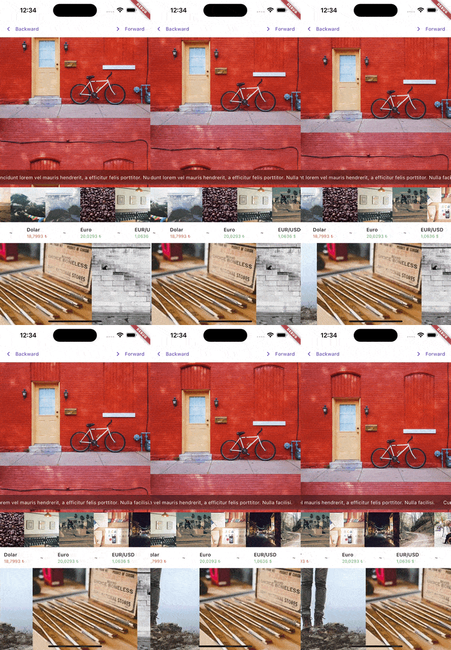
The Marqueer package is a versatile Flutter widget designed to create smooth and customizable marquee effects. Whether you're building a news ticker, scrolling advertisements, or any animated content display, Marqueer offers flexibility, performance, and user interaction controls.
With support for infinite scrolling, dynamic item generation, and highly customizable animation behavior, Marqueer ensures an engaging and fluid user experience.
- Directional Scrolling: Scroll content in any direction—right-to-left, left-to-right, top-to-bottom, or bottom-to-top.
- Infinite or Finite Scrolling: Display unlimited content or stop after a specific item count.
- Customizable Speed: Control scroll speed with a
pps(pixels per second) parameter. - Interactive Control: Pause and resume scrolling based on user interactions.
- Dynamic Content: Use the
builderconstructor for generating items dynamically. - Responsive: Automatically adapts to screen size changes and other layout updates.
- infinity: When
true, the widget creates an endless loop by either:- Duplicating the content after the original list ends and continuing seamlessly.
- Reversing the animation direction when the list ends.
By adjusting the infinity parameter, you can control how the marquee behaves at its boundaries, ensuring a smooth experience regardless of content length.
-
direction: Defines the scroll direction. Options include:rtl(Right-to-Left)ltr(Left-to-Right)ttb(Top-to-Bottom)btt(Bottom-to-Top)
-
pps: Pixels per second, controlling the speed of the scroll animation. For instance,pps: 15.0means 15 pixels are scrolled every second. -
infinity: Abooldetermining how the scroll behaves after reaching the end of the list. When enabled, it either duplicates the content or reverses the animation. -
autoStart: Aboolcontrolling whether the marquee starts automatically when the widget is built.
interaction: Iftrue, pauses the animation on user touch.restartAfterInteraction: Automatically restarts scrolling after user interaction if enabled.restartAfterInteractionDuration: Specifies the delay before restarting, e.g.,Duration(seconds: 3).
separatorBuilder: Adds a separator widget between items in the marquee.padding: Adds padding around the scrolling content.
onStarted: Triggered when the animation starts.onStopped: Triggered when the animation stops.onInteraction: Called when a user interacts with the marquee.onChangeItemInViewPort: Invoked when a new item enters the viewport.
controller: An optionalMarqueerControllerto programmatically control the marquee (e.g., start, stop, or change direction).edgeDuration: Adds a delay when the marquee reaches the edges, useful in finite scrolling scenarios.
The scrollablePointerIgnoring parameter is a boolean that resolves gesture-related issues caused by Flutter's default IgnorePointer behavior within Scrollable widgets. When set to true, it ensures that the IgnorePointer behavior in nested scrollable elements is bypassed, allowing gestures to propagate correctly.
Flutter's Scrollable widget applies an IgnorePointer by default to prevent unintended interactions during animations. However, this can interfere with custom gestures or user interactions in certain scenarios. Enabling scrollablePointerIgnoring ensures smooth and predictable gesture handling.
false: The defaultIgnorePointerbehavior remains active.true: Disables the defaultIgnorePointerbehavior, allowing gestures to work as expected.
final controller = MarqueerController();

/// controller.start()
/// controller.stop()
/// controller.forward()
/// controller.backward()
/// controller.interactionEnabled(false)

SizedBox(
  height: 30,
  child: Marqueer(
    pps: 100,
    /// optional
    controller: controller,
    /// optional
    direction: MarqueerDirection.rtl,
    /// optional
    restartAfterInteractionDuration: const Duration(seconds: 6),
    /// optional
    restartAfterInteraction: false,
    /// optional
    onChangeItemInViewPort: (index) {
      print('item index: $index');
    },
    onInteraction: () {
      print('on interaction callback');
    },
    onStarted: () {
      print('on started callback');
    },
    onStopped: () {
      print('on stopped callback');
    },
    child: const Text(
      'Lorem ipsum dolor sit amet, consectetur adipiscing elit. Integer pretium massa mollis lorem blandit imperdiet. Nulla mattis vitae mauris vel condimentum. Nam posuere, augue vitae lobortis consequat, odio ante condimentum est, at maximus augue purus id metus. Curabitur condimentum aliquet ante at aliquet. Quisque vel massa congue, bibendum leo sodales, malesuada ante. Maecenas sed tortor quis ipsum dictum sollicitudin.',
    ),
  ),
);
Usage with builder
SizedBox(
  height: 50,
  child: Marqueer.builder(
    itemCount: 200,
    interaction: false,
    scrollablePointerIgnoring: true,
    itemBuilder: (context, index) {
      return GestureDetector(
        onTap: () => print('tapped $index'),
        child: Padding(
          padding: EdgeInsets.all(4),
          child: Text('index: $index'),
        ),
      );
    },
  ),
);
Basic usage
SizedBox(
  height: 50,
  child: Marqueer(
    child: AnyWidget(),
  ),
);